Vight Website Revamp: Bright, Streamlined & Client Focused
Vight is a Vietnam-based international design practice specialising in bespoke decorative lighting solutions. I revamped Vight's existing site by migrating it over to Framer with a bright design, streamlined structure, and focus on hospitality projects, boosting user experience and client conversions.
Client
Vight
DELIVERABLES
web design
Framer website
Year
2024
Role
Web designer
Framer website developer

Redesigned Portfolio
The Brief
How might we better showcase Vight’s value to clients and refocus the website towards design for hospitality projects?
The previous site was over 5 years old and was due for a complete redesign. The client wanted to refresh the site with a brighter look, update their portfolio and redefine their service offering to attract more clients for hospitality lighting design. I began by conducting a competitor analysis and an audit of the existing site.

Vight’s previous design with notes from the audit I conducted
The opportunity
Simplifying
the user experience
The existing site failed to convey Vight’s services and value to clients. The user experience had not been previously considered, making it confusing to navigate and difficult to find relevant information. This resulted in a high bounce rate before visitors could explore the company’s portfolio. The portfolio’s structure was also confusing, causing visitors to overlook the hospitality section and mistakenly believe they could purchase unavailable collections.
So the opportunity was clear, we needed to simplify and restructure! This would involve creating a new sitemap to refocus the information architecture and also define the ideal visitor journey through the site. By doing this, alongside a visual design overhaul, I ensured the site would be a pleasure to use for prospective clients, making their visits more likely to convert to sales.

Before • Original Sitemap

After • New Sitemap
The Design
A brighter, streamlined design with clear navigation & brand consistency
Hospitality projects
take centre stage
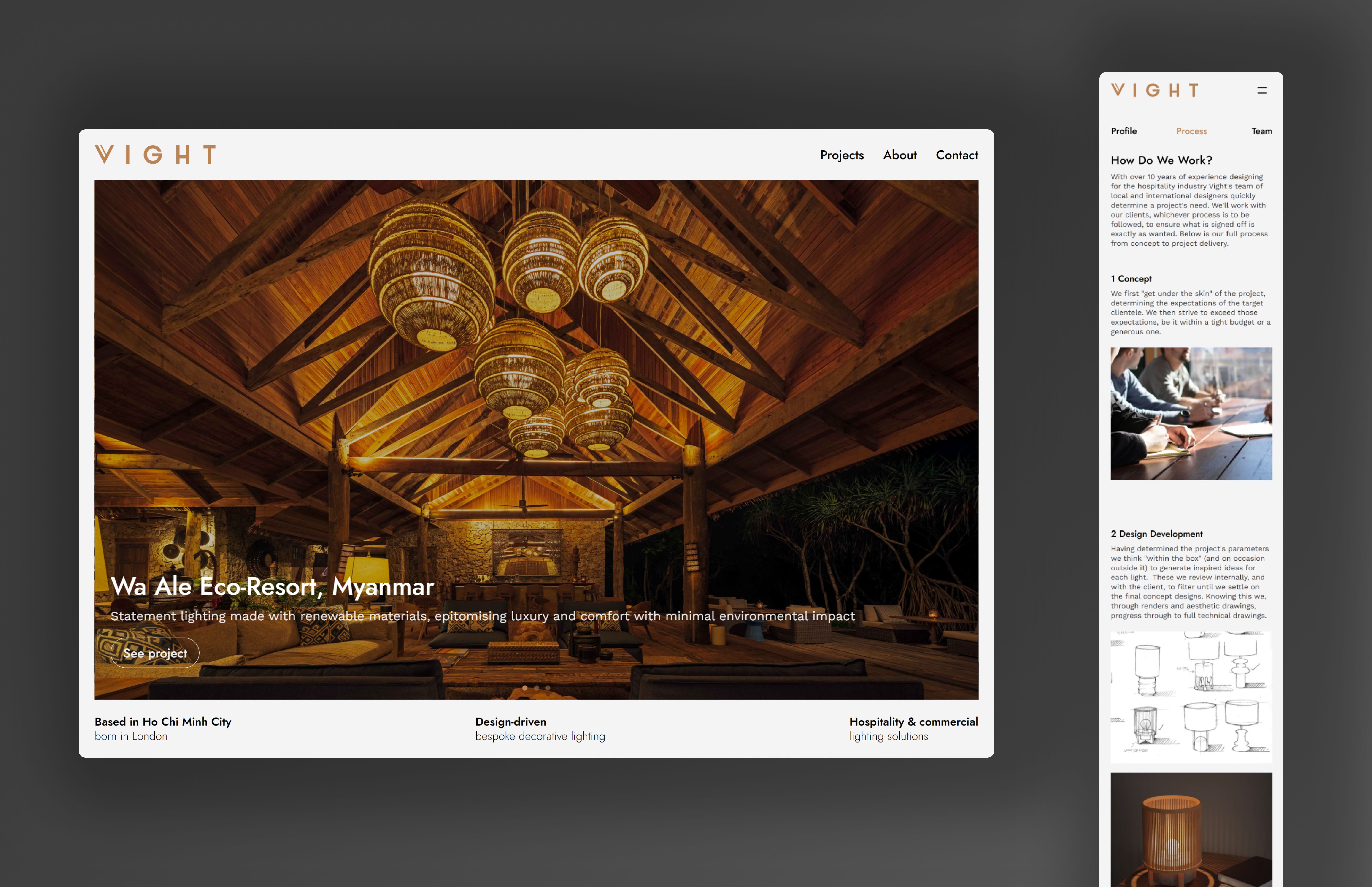
The landing page features a clean, minimal design that guides users straight into projects, ensuring a clear and intuitive site navigation. Updated imagery and renders highlight Vight’s contributions to past projects, making their expertise instantly recognisable.
Easily digestible,
relevant information
I redesigned the About page to consolidate all key information about Vight in one place. Adding a secondary menu improved navigation and prevented information overload by allowing the user to jump to information relevant to them. Services and brand identity are clearly defined, with redundant content removed to keep only what’s essential.
Brighter with
brand colors
I enhanced readability with updated fonts and incorporated Vight’s existing brand colors. The site background was refreshed to an off-white, creating a brighter look in line with the client’s request.